How Webamazee Redesigned Shine Gold Tours India's Website for Better UX
A complete UI and UX redesign that transformed an outdated, slow travel website into a clearer, faster and more conversion-focused experience.
Project Type
Travel website redesign
Industry
Travel and Tourism
Country
India
Completion
2025
Focus area
Website Redesign / Travel & Tourism
Process-led engagement
 Desktop
Tablet
Mobile
The client and the brief
Shine Gold Tours India is a travel and tourism business whose existing website needed a complete visual and usability improvement.
The previous website was outdated, slow and difficult to navigate. It did not provide the modern experience expected by travel customers or guide visitors clearly through services and tour offerings.
Business at a glance
An Indian travel business requiring a complete redesign to improve presentation, usability, performance and lead generation.
Objectives
- Replace the outdated visual interface
- Improve loading and mobile experience
- Create a clearer information hierarchy
- Present tours and services more effectively
- Strengthen calls to action and lead journeys
Project Scope
Existing-site review, information architecture, full UI and UX redesign, responsive frontend improvement, content reorganisation, performance work, SEO foundations and launch.
Timeline
A focused redesign engagement covering discovery, interface redesign, responsive implementation, testing and release.
Team
Webamazee design and development support working through a complete redesign rather than a superficial visual update.
The story in three parts
Slow load times, an outdated interface and weak information hierarchy created friction and increased the likelihood that visitors would leave before engaging with the business.
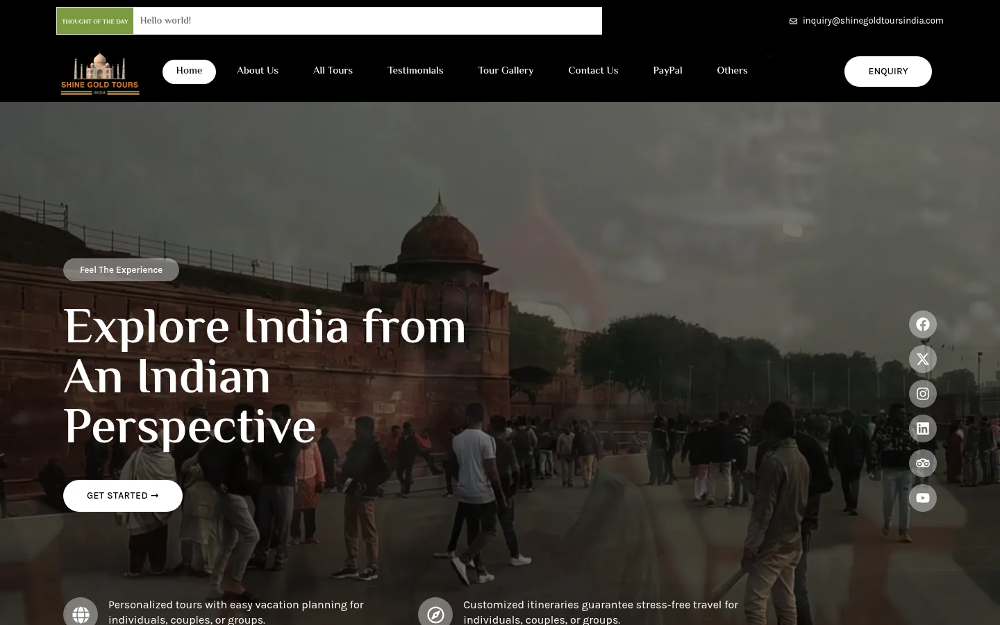
We transformed the experience with a complete UI and UX redesign, clearer navigation, improved content presentation, responsive layouts, cleaner frontend delivery and stronger calls to action.
The redesigned website provided a stronger platform for presenting services, began attracting traffic and helped the business receive leads through the improved digital experience.
What was happening before the project
The previous website used an outdated visual interface and did not communicate the quality of the company's travel services effectively.
Slow pages, weak navigation and unclear content structure created unnecessary friction. Visitors could lose interest before understanding the tours or reaching an enquiry action.
Problems we set out to solve
Outdated design
The interface did not communicate the quality of the company's travel services.
Slow loading
Performance problems created friction, especially for visitors on mobile devices.
Poor user experience
Navigation and content hierarchy did not guide users effectively through available offerings.
Weak conversion journey
Calls to action and service presentation needed to support enquiries more clearly.
How we researched and planned
Existing-site audit
We reviewed the old interface, page hierarchy, navigation and performance issues.
Content inventory
Tour and service information was assessed before the new structure was planned.
User journey review
We identified where visitors could lose context or leave before enquiring.
Redesign priorities
Visual clarity, speed, mobile usability and conversion paths guided the work.
Shaping the experience
Modern visual system
Typography, spacing, imagery and interface elements were redesigned consistently.
Improved hierarchy
Tour and service content became easier to scan and understand.
Clearer navigation
Visitors can move through offerings with less friction.
Stronger CTA placement
Enquiry actions appear in context throughout the journey.
From build to launch
Responsive implementation
The redesigned interface was built for desktop, tablet and mobile.
Frontend cleanup
The experience was simplified to reduce unnecessary visual and interaction overhead.
Performance improvements
Media and page delivery were reviewed to support faster loading.
Content restructuring
Tour and service information was integrated into the new hierarchy.
SEO-ready structure
Headings, metadata foundations and internal links were considered during redesign.
Testing and launch
Navigation, responsiveness and important enquiry routes were checked before release.
What was delivered
Modern homepage
A stronger first impression for the travel brand.
Tour presentation
Clearer organisation of destinations and services.
Responsive navigation
Improved usability across screen sizes.
Lead CTAs
More visible and contextual enquiry actions.
Improved hierarchy
Content is easier to scan and understand.
Cleaner frontend
A more focused experience with reduced friction.
SEO foundations
Search-friendly page and heading structure.
Trust presentation
A professional visual experience that better represents the business.
Before & After Transformation
See how thoughtful design, performance optimization and strategic improvements transformed this website. Drag the handle to compare.
Stylised previews for illustration
Homepage Experience
Modern UIAn outdated interface was replaced with stronger hierarchy, modern presentation and clearer calls to action.
Tour Information
Clearer StructureTour and service content was reorganised so visitors could understand available experiences more quickly.
Mobile Journey
Mobile FirstResponsive layouts and direct enquiry actions reduced friction on smaller screens.
Design showcase
Optimisation work performed
Where exact scores aren't verified, we describe the optimisation work itself rather than reporting unverified figures.
Information architecture
Tour and service pages use a clearer hierarchy.
On-page foundations
Headings, metadata and internal links support search understanding.
Performance focus
Cleaner delivery and media handling support a faster experience.
Responsive usability
Mobile visitors can navigate and enquire more easily.
Content presentation
Travel information is structured around visitor needs.
Conversion paths
Search and referral visitors have clearer enquiry actions.
What the work achieved
Outcomes are presented qualitatively, focused on the observable improvements the work delivered.
A modern visual experience that better represents the travel business.
Clearer navigation and tour information.
A faster, more usable experience across devices.
Stronger calls to action and lead journeys.
The redesigned website began attracting traffic and helped the business receive leads.
Built with the right tools
Services behind this project
More projects to explore
About this project
The existing site was outdated, slow and did not guide travel customers clearly through the company's services.
Ready to Build Your Success Story?
Tell us about your goals and we'll craft a tailored plan — with a free consultation to start.
- Free personalised roadmap
- Reply within 24 hours
- No lock in